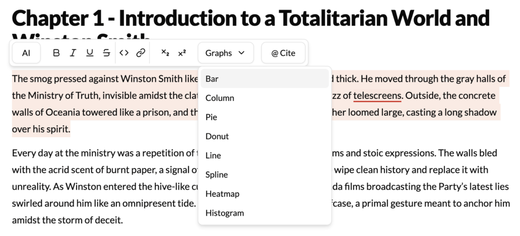
What It Does?
The Graphs Generation tool is a unique and powerful feature for non-fiction, academic, and business writers. It transforms textual descriptions of data into clean, professional visual representations like bar charts, pie charts, and line graphs. This allows you to create data visualizations directly from your text, making your work more impactful and easier to understand.
How to Use It?
- Write Your Data Description: In your text, write a clear description of the data you want to visualize. This can be in sentence form or a simple list.
- Highlight the Data Text: Select the entire description.
- Click Graphs Generation: Choose the option from the menu.
- Configure Your Graph: A dialog box will appear, prompting you to:
- Choose a Graph Type: Select Bar Chart, Pie Chart, Line Graph, etc.
- Confirm Labels and Values: The AI will automatically identify the labels (e.g., “Q1,” “Q2”) and values (e.g., “15%,” “20%”). You can edit these if needed.
- Add Titles: Give your graph a title and label your X and Y axes.
- Insert the Graph: Click “Generate,” and an image of the graph will be created and inserted into your document.
Example
Highlighted Text:
“Our quarterly product sales showed steady growth. In Q1, we sold 500 units. In Q2, sales rose to 750 units. Q3 saw a peak of 900 units, before a slight seasonal dip to 850 units in Q4.”
AI Configuration:
- Graph Type: Line Graph
- Title: Quarterly Product Sales
The tool would then generate a clear line graph visualizing this trend.
Best Use Cases
- Business Reports: Quickly create charts to visualize financial data, sales trends, market share, or customer survey results, making your reports more professional and easier to digest.
- Academic Papers: Represent experimental results, statistical findings, or demographic data visually. A good graph is often more powerful than a paragraph of text for conveying data-driven conclusions.
- Presentations and Proposals: Generate clean visuals for your slide decks without needing to use separate, complex spreadsheet software.
- Infographics and Blog Posts: Break up long-form content and make data points more memorable by embedding simple, clear charts and graphs.
Pro-Tip
Keep your source text simple and clear. The AI is very good at parsing data, but it works best with straightforward statements. Using a format like “Label: Value” or simple sentences as shown in the example will yield the most accurate results.